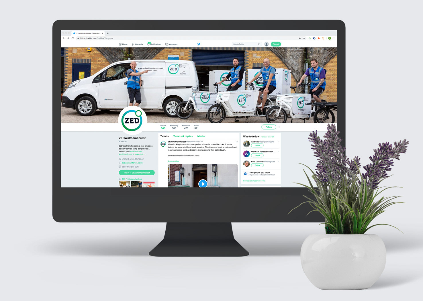
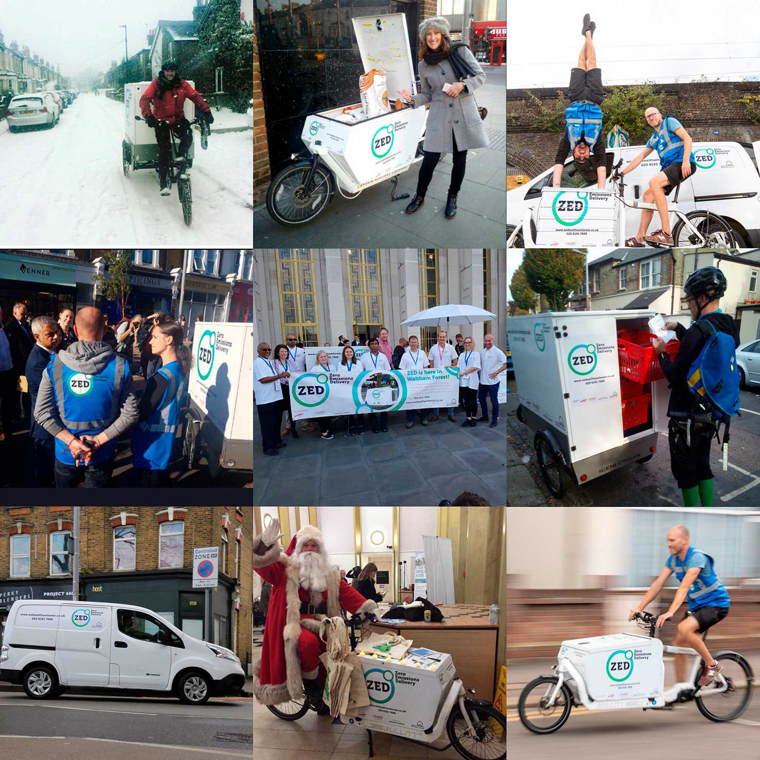
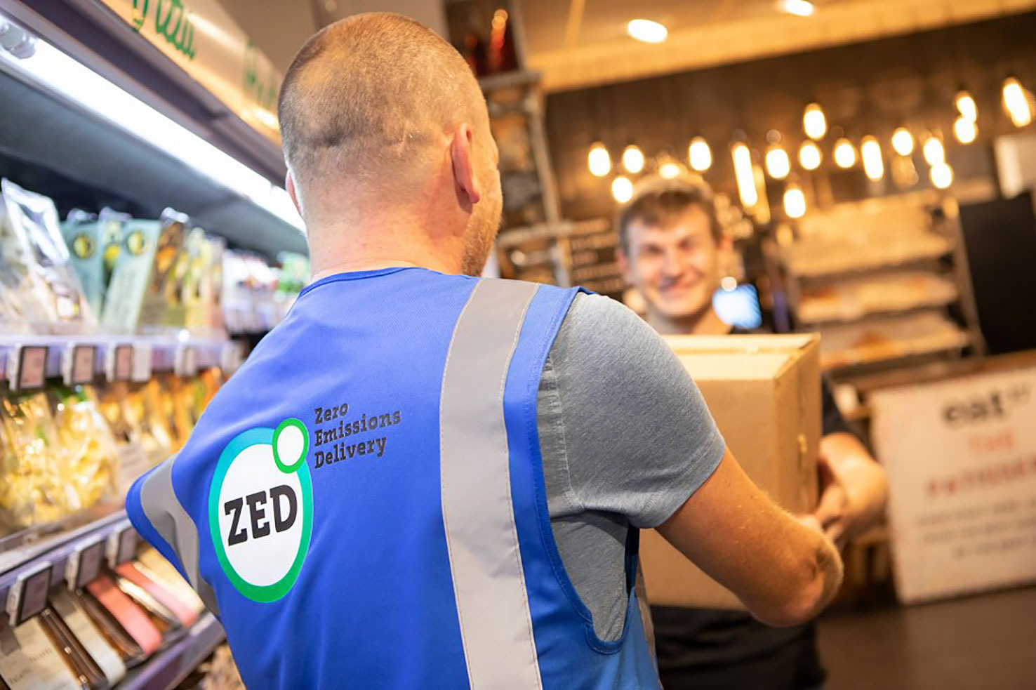
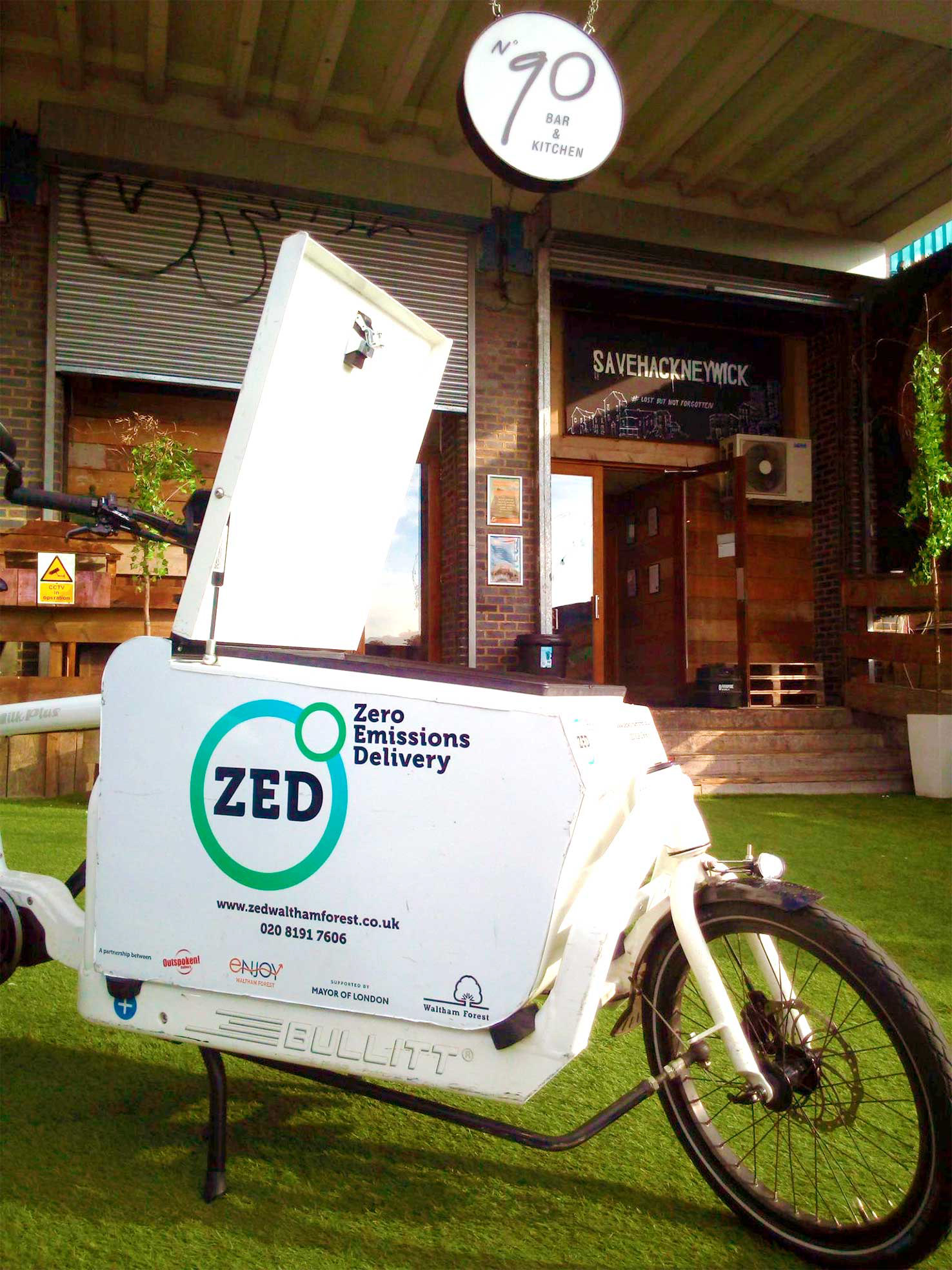
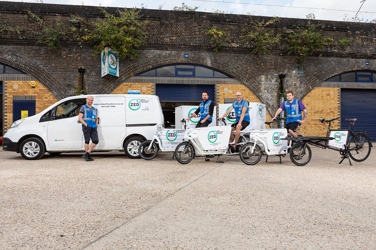

Task – This London borough's priority was to reduce the air pollution of their local businesses and were providing a cycle and trike delivery service. They wanted a way to make their service stand out to encourage use. Solution – The development of an identity that was clean and legible at distance with the use of a heavy slab font. The circles and choice of colour implied nature and purity along with the shape of the world and wheels of the cycles and trike. The brand has been implemented on livery, leaflets advertising the service, 'Whilst you were out' delivery notices and a YouTube video promoting the service.